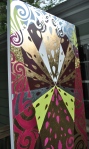
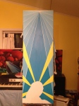
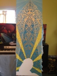
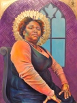
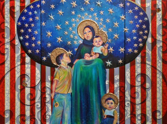
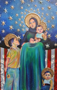
This newest painting in the An-Noor series is a three paneled piece titled Maestà. The title means “Majesty” in Italian and “designates an iconic formula of the enthroned Madonna with the child Jesus, whether or not accompanied with angels and saints.” (wiki)
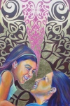
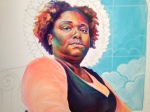
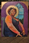
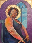
The subjects are my friend Amani, her son, and twin daughters. She’s a badass mom whom I really respect and admire.
The most direct inspiration for the painting is Giotto’s Madonna Enthroned.

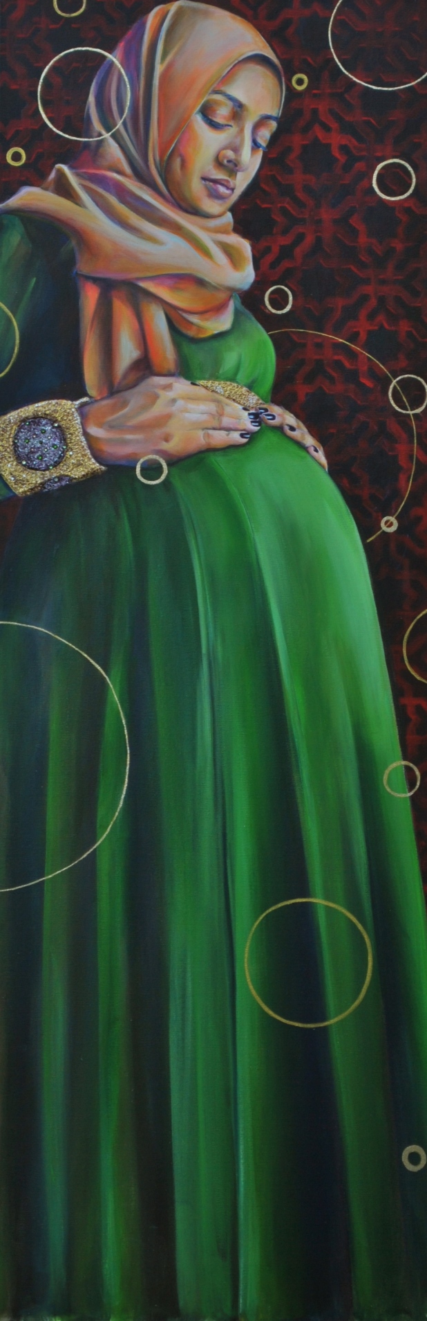
When researching historical portraiture/iconography with strong and powerful figures, I came across many images of male political, military, religious figures, and superheroes. There were, however, a few notable exceptions (see Rosie the Riveter). The most striking of these exceptions are images of Mary, mother of Jesus. Her image has been produced and reproduced, she is immensely recognizable, but remains a dynamic figure. Not to mention that she is an important figure in Islam as well as Christianity. I feel that Mary, an embodiment of both strength and gentleness, was the perfect image to take on for this body of work, to explore motherhood as a part of female strength, because I think that a woman’s natural role as a mother is one that does not diffuse her power, but reflects it.


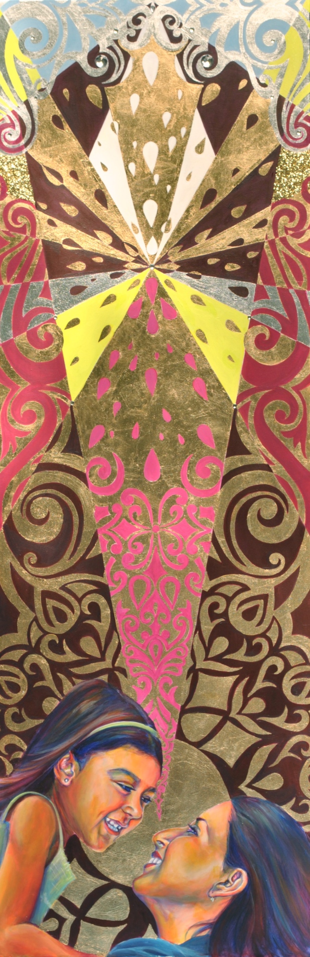
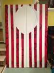
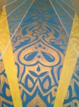
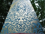
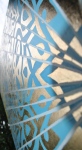
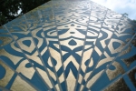
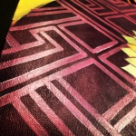
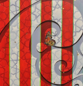
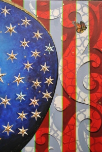
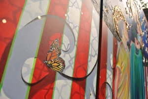
The American flag, which pretty clearly identifies the subjects as American, has a few references within it. In the stripes, I created an organic design that has a geometric pattern within it. The geometric pattern is a pretty typical Islamic pattern. I also included a bright green line into the stripes (complementary colors!) to give it a little kick.

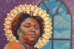
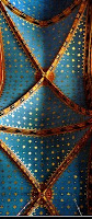
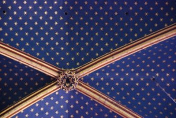
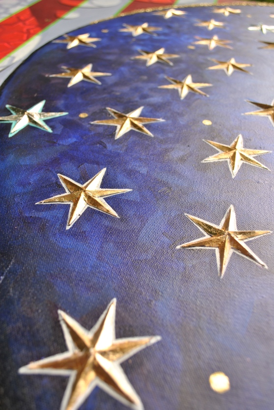
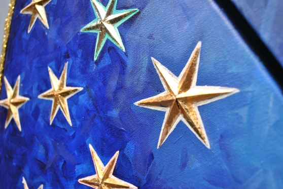
The stars are a reference to the blue domed church ceilings with gold or yellow stars. I saw many ceilings like this when I went to Italy as a 17 year old. They really stood out to me, but I hadn’t thought of them in years, until I started drafting this painting. I haven’t been able to find a definitive resource that explains the meaning of the starred church ceilings. The most I could find was on this blog, where the author had the same question about the significance of these stars after seeing them in a number of churches. She found that “painted yellow stars against a blue background on its vaulted ceiling [are] symbols of Saint Mary in Catholic tradition.”
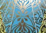
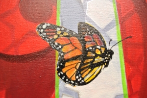
There are also a couple of butterflies (yummy symmetry and beautiful metaphor) and a sunflower (in the boy’s hand, a reference to a previous painting). Adding these elements was pretty spontaneous and last minute, but I really love what they do for the painting.
Technique/Materials
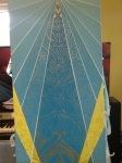
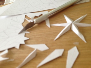
The stars were each made of six diamond-shaped pieces of cardstock that I cut with an exacto knife. I made a shallow cut down the middle of each diamond so they would fold in half cleanly. I would fold the diamond shape, fill it with gloss gel and modeling paste, then adhere to the canvas. Originally I had hoped to just sculpt the stars out of the modeling paste, but it was not rigid enough. I attempted to “pipe” the paste into star shapes as though I were using icing, but that was a big fail, as well. I had to try to scrape some of it off, which only kind of worked. It was a messy and tedious process (I don’t know how many hundreds of diamonds I had to cut and recut), but at the end, the stars look a lot like what I remember seeing in Italy so many years ago.
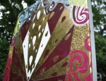
The stars were then painted and gold leafed, and traced. Some of them are silver, for fun.
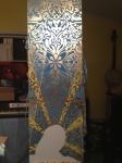
The halos are made from gold mica flake, gold sequins, modeling paste, and rhinestones. I used a butter knife to spread the modeling paste and mica flake.
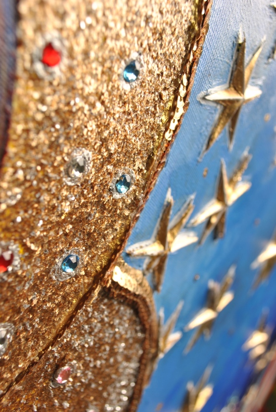
Around the blue area I used black glitter (on the bottom) and gold glitter at the top.
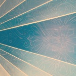
There is some pattern painted on top of the figures (most of it is towards the bottom of the canvas) with a silvery glaze that only appears at certain angles.
The patterning in the stripes was all drafted ahead of time using my Sketchbook app. For the figures, I spliced together a bunch of different photos (y’all know that it is impossible to get a family picture where everyone looks normal at the same instant).
This painting feels a bit different to me. I had to figure how to do a lot of new things, work with a lot of new materials, because just gold leaf and acrylic paint wasn’t going to cut it for this painting. I kept feeling like I needed to go “over the top” with the ornamentation on this piece, that I needed to do too much. I think that the final product actually turned out pretty balanced, but that sentiment helped me to take it far outside my comfort zone.
I also am not so concerned with describing this painting’s meaning too specifically. It is both abundantly clear what this piece means, and open ended enough that I trust that whatever people get from it is accurate.
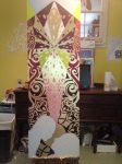
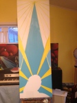
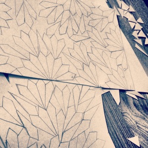
Check out the gallery for a few process pictures.